|
10/30/2015 14 Comments 3rd CritiqueBelow are 4 strong images: analyze and discuss the strong elements and principles in the comments section.
14 Comments
Montana M
10/30/2015 05:32:41 pm
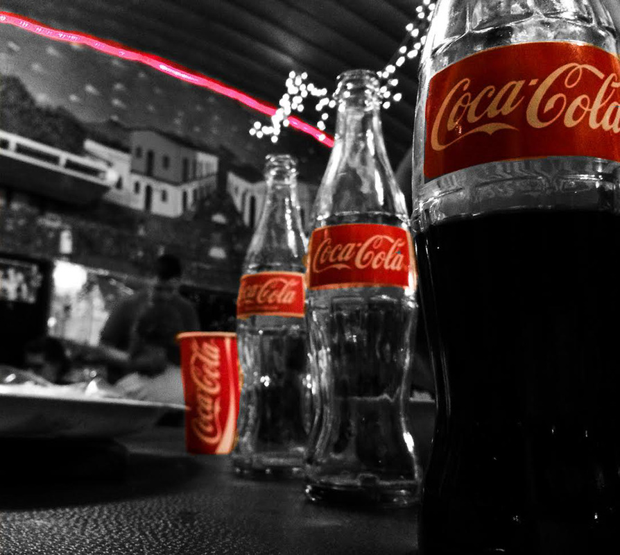
I really like the Coke bottles. The cup draws away from the image to me though.
Katie m
10/30/2015 06:03:04 pm
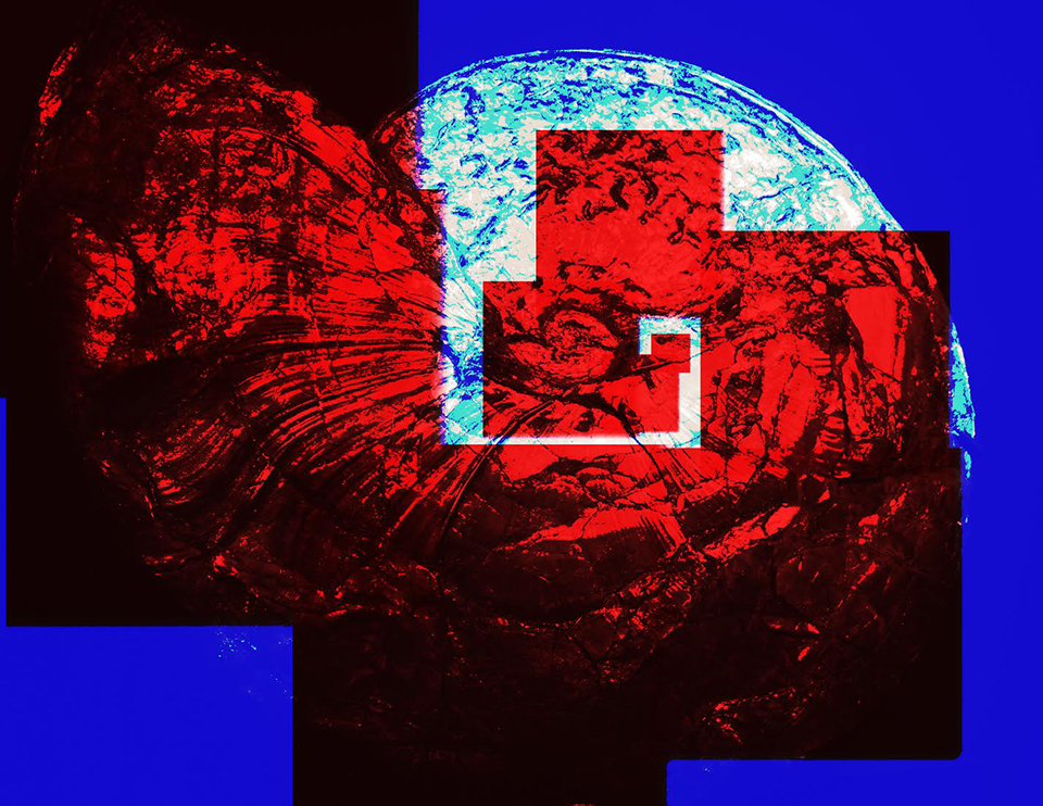
The juxtaposition of the square and round shapes in the second image makes it really interesting. I don't really know what the age is but that's what makes it interesting.
ian skinner
10/31/2015 02:24:38 pm
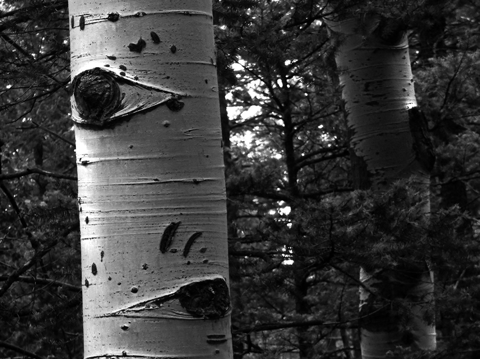
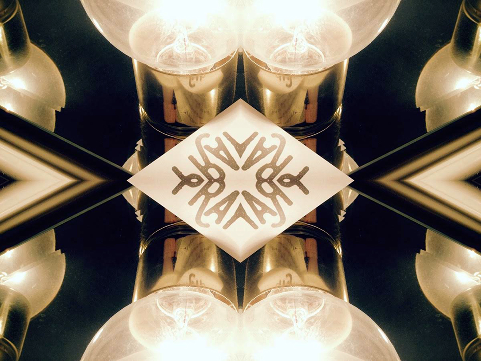
I'm really liking the coke one. the movement is good and i like the color and contrast.the quaking aspen is also pretty cool with its background popping the tree out. the light thing has a nice warm coloring and i like the hard edges on it.
Gianna Martucci
11/1/2015 01:10:55 pm
In all the photos there is a sense of movement, whether it is created by the repetition of color, lines, or form. There is a clear focal point in all photos, and the different forms of repetition tell the viewers eye where to look second, third, ect.
David M
11/1/2015 02:34:28 pm
Most obvious is movement and repitition. I really like the Coke bottles Rey really catch the eye with the repitition and the odd one out.
Jeremy Lebs
11/1/2015 02:42:07 pm
Bottom one is my favorite, I absolutely love the 4 way mirroring of the original picture and the color used is also very great!!
Logan Ressler
11/1/2015 07:16:45 pm
Loving the color used in the Coke bottles. Not many people are talking about the red and blue picture. The movement in that one is wonderful, along with the shapes (circle, and squares) very well put together piece.
Brittany M.
11/4/2015 04:59:36 pm
The repetition of the Coke bottles in the red creates nice movement. But the pink line in the background is distracting. I also like the red spiral it how it creates movement in like a triangle that points to the white semi circle. There is great contrast on the main white tree which is a great focal point. There is balance in the symmetry in the last picture.
Michael
11/5/2015 11:54:51 am
The soda bottles have great reputation the outlier is the cup. I also like the reputation on the forth one as well as the darks and lights. On the second pic I love the reputation of the shell with the red and blue create movement.
michael campo
11/6/2015 04:48:04 am
I like the repetition of the coke bottles and cup but i think the red line distracts from that.
Liz Redd
11/10/2015 07:50:31 am
The one in the top right corner is strong to me. It follows to golden spiral to an extent, even though the center of the spiral is in the center of the page.
Jessica C
11/11/2015 05:22:54 am
I really like all of the red in the first two photos, they really draw me in. In the coke bottles photo my eye automatically hits the red and the repetition. Then in the second the red also stands out.
Courtney Unruh
11/13/2015 05:10:20 pm
Image one uses repetition and exploration of the Coke logo. Although the background of the photo isn't appealing to me as a viewer.
Erin H
11/20/2015 10:16:22 am
All of the pieces have strong shape and high contrast colours. My favourite definitely has to be the tree picture Leave a Reply. |
YOUR ROLEImages will be posted and Constructive Criticism will be engaged between students through comments section. Archives
December 2015
Categories |
 RSS Feed
